If you’re not a graphic designer or at least working in a creative field where you make written or visual content, probably not.
But what do you do when life forces you to think about fonts? The ability to choose and pair fonts comes in handy in situations like making cards, resumes, essays, invitations and so many more everyday items!
How many times have you seen someone throw together a bunch of information with way too many fonts and colors? It’s confusing and unprofessional.
grantnieddu/steemit
Ugh. That’s nightmare fuel.
Like wine and cheese, peanut butter and jelly, or Bert and Ernie, fonts must be selected to complement each other. Combined, they make something special.
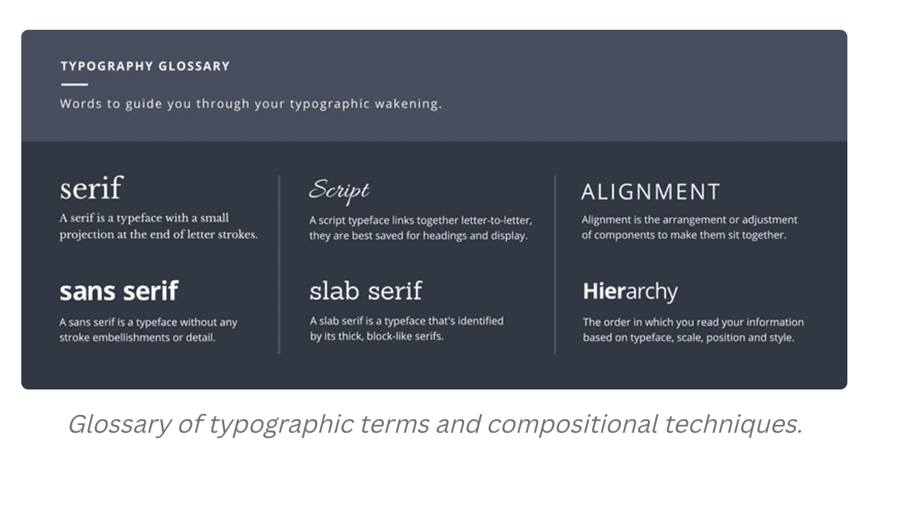
Here’s a quick reference guide from our friends at Canva:
Going into too much depth about pairing fonts can sound like gibberish to non-designers, but I’ll break the most important stuff down so you can be ready for any project!
TYPES OF FONTS
There are a few different types of fonts: Sans Serif, Serif, Slab Serif and Script. While there are a few others, these 4 categories are most common.
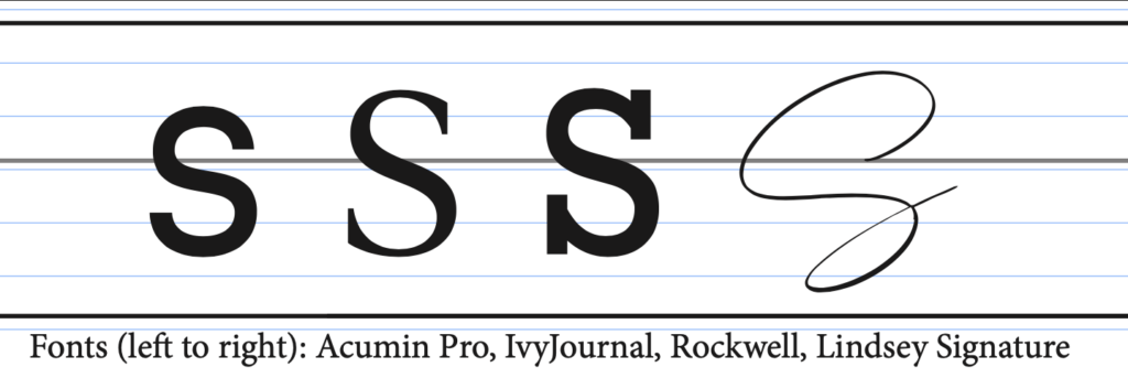
The font on the left is a sans serif font. This means that the ends of the letters are flat. In fact, this blog uses a sans serif font!
The left-middle font is a serif font. This is a more traditional font, with accents on the end of the letter. The most well-known font in this category is Times New Roman. This font is required for MLA format for school essays. This type of font is also commonly used as body copy fonts and/or captions.
The middle right font is a slab serif. It is a more decorative highlight font that is mainly used for headers or to emphasize a message. The characteristics of this font are very similar to serif fonts but at a thicker weight.
The last font on the right is a script font. This type of font is only used for titles. This type of font is most known for being used in wedding invitations. Using this type of font is not advised to use as body copy because it will not be readable.
WAIT, WAIT…SLOW DOWN
Jargon much?
“Why should I need to know all of these details about font types?” you’re asking.
Well, it’s important to know the terms you’ll run into when searching for fonts! While you may be thinking this is too complicated, it will be very useful for any project, from writing reports and resumes to designing social media graphics.
And sure, you could hire a designer to help you (as a designer, I definitely think you should hire designers), but it is still good to know some basics about font pairing. Often, people in the decider role will say, “I know what I don’t like,” because they don’t quite know how to translate what they want into words that move the conversation forward with a designer. Having some technical expertise can make it easier to both appreciate the craft and to communicate the changes you feel need to be made.
LET’S START MATCHING!
Naturally, each font has a different style and conveys a different feeling.
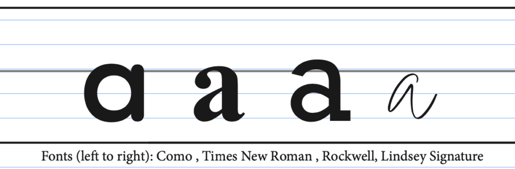
The left-most font has a very different look, compared to the other three. Instead of having the loopy “a” it has a simple “O” with a line. The middle two font styles are very similar with the loopy “a” styles. The style of the last “a” is also very different from the others, because it is tighter and has a thinner font weight.
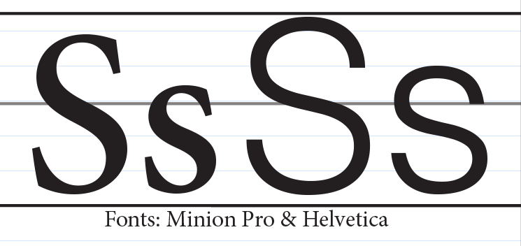
When pairing fonts, you should also consider the size of the letters. Between the two fonts below, the lowercase “s” for the font Helvetica is much bigger than the “s” in the Minion Pro font.
Having similar sizing helps two different fonts pair together smoothly. The two fonts below will not pair well together.
You may sometimes want to have a header or other element that is bolder, to stand out from all the other text. Font “weights” are not standard, meaning one font at a regular thickness can occasionally look the same as the other font when it is at medium or bold thickness.
To put it simply, they’re just built different!
When fonts are too similar in that way they cannot pair together.
TL;DR CHEAT SHEET
Graphic designers can go on and on about font selection and theory all day long. But you probably just want some good, useful tips you can reference.
Gotcha’ covered!
WHAT TO CONSIDER WHEN MATCHING FONTS
Category and Classification of Fonts:
- You can use two different fonts in different classifications or you can use the same. If there are enough similarities in the other elements the types of fonts should not be a big concern.
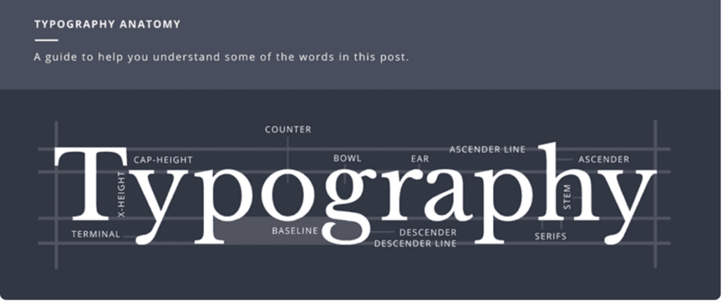
X-Height
- Having a font with a similar height helps the two different fonts to work cohesively. Sometimes you can match fonts with a different X-height but that also relies on the other factors.
Character Width
- It is a good idea to match or pick similar fonts with the same spacing between letters. Sometimes it could work if you pair a condensed font with a regular font depending on the other similarities.
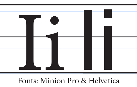
Glyph Styles
- Glyph styles are very important. If you pair two different fonts that have the letter “i” having a circle dot versus a square dot it may look a bit strange. These apply to any letters and symbols. They all vary by the font and the type style.
Font Weight
- Sometimes when pairing fonts the weight can vary. In some cases When the title font is paired with a smaller bold font, attention will be focused more on the bold font than the title.
FONT-MATCHING TIPS FOR NON-DESIGNERS
Combine a serif with a san serif font
- Combining these two styles of fonts create more contrast between the header and the body text. This makes it more appealing to look at and easier to read.
- But be careful not to pair fonts that are too different that won’t look good together.
Avoid Similar Classifications
- Avoid choosing Slab or script font with the same classification for body text.
- If you use a slab text as a header pairing it with a san serif is a good suggesting for classification matching
Contrasting Sizes
- Text size is important when it comes to the header and the body.
- If you have a header that is about 36 pts your body copy needs to be around 18 pts.
- Having the header be bigger helps readability
Contrasting Font Weight
- Having a header with a thin font weight will not stand out against a thin weight body copy.
- Using a thicker weight font for the header creates a visual hierarchy while using a light or regular font weight.
Avoid discordant combinations
- Pairing a script header with a script body copy are bad pairing for the sake of readability and the chance the two different fonts and types of script could be very different styles
- Pairing a script header with a serif body could work depending on the exact fonts you are working with.
Pairing with same typeface
- Using a font with many styles like Lato or Raleway is always a good option and will save you a lot of time when attempting to pair different fonts
- But do not use a light weight font with a light weight body text. The header has to be a thicker weight than the body copt font.
Stick to 2-3 fonts
- It is recommended to pair no more than 3 fonts together preferably 2.
Experiment with different sizing
- Some fonts are better to read at a smaller size verses a bigger size.
- The factors that affect sizing are if the font is condensed, bolded, light weight, etc…
IN CONCLUSION
Graphic design is an incredibly important and valuable asset to any business or organization. From logos to email layouts to website design to letterhead to any number of regular digital marketing needs, presenting a polished and professional look is important to maintaining your brand.
Want to talk about your company’s graphic design needs? Thinking about a rebrand or looking to spice up your social media or email communication so better engage your target audiences?
Slice can help!
Reach out today and share your goals with our team of creative professionals – including several graphic design professionals!
Sources:
https://medium.com/8px-magazine/practical-guide-to-font-pairing-da58b9bcd42b
https://www.canva.com/learn/the-ultimate-guide-to-font-pairing/