“Can you make it pretty!?”
“Can you make it pop?!”
Designers face these two age-old questions pretty often when working with clients. The battle between aesthetics and function is nothing new, but we designers have failed to explain the difference and importance of each – and how they apply to creative work. It’s okay. We can admit it. We just haven’t connected those dots, to use a kind of artsy analogy.
Until now! Clients, I’m here to shed some light on that issue once and for all! Don’t speak Art? No problem! That’s why you hire designers.
Aesthetics vs. Function in the Design World
The definition of aesthetics reads as follows: “a set of principles concerned with the nature and appreciation of beauty, especially in art.”
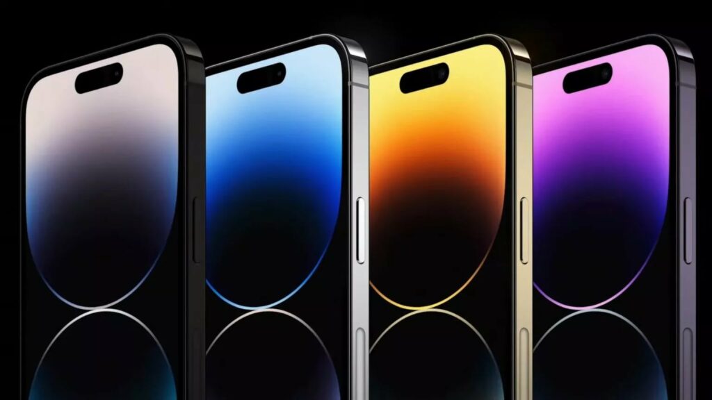
In design, aesthetics aim to appeal to the eye and evoke emotions. Many brands and companies use aesthetics to call to consumers and bring them in with. For example, in the technology industry, Apple is a great example of using aesthetics. Their laptops, phones, and other devices all look sleek, modern, and futuristic at times.
In the automotive industry, luxury car brands such as Mercedes, Rolls Royce, and Aston Martin appeal to the senses of drivers to encourage them to purchase their vehicles.
We can even see aesthetics play into furniture design, fashion, and architecture!
However, aesthetics can only get you so far Because what is something that is pretty or interesting if it does not work. That is where function comes into play.
Function, defined “an activity or purpose natural to or intended for a person or thing,” is an important principle for companies, organizations, and industries to follow that allows their services or products to be the most helpful, productive, and useful.
Function is the main objective of a piece of graphic work. How well a design is explored and executed will determine whether or not it will meet that end.
The ultimate goal of any graphic design is to communicate and make an impression, but that the right impression is made and the intended outcome is achieved is equally important.
That is why designers usually create with the user in mind. Some of the confusion may be that the client can – sometimes – forget that they are not necessarily the target audience of the piece! Not you. You totally get it. But other clients might not.
Sacrificing functionality for looks is not recommended and leads to problems in the long run. Coming from a thoughtful place rather than a subjective place is always preferable.
When a client says this without providing actionable steps for making a design “pop,” their design vision is often hazy.
What we do know is that both clients and designers have a shared goal in mind: “excellent design!”
So, how do we know what’s great?
Each client has their own set of requirements. Many designers believe that when clients are unsure of what they want, they are on a bit of a wild goose chase. But it’s really just a puzzle to be solved and an opportunity for better questions and more clarification!
For example: if you see vibrant colors in their design inspirations, you can assume that the client wants vibrant colors. If you see custom fonts in their examples, maybe that’s what they want to do. Are they looking to stand out? Something more customized and unique may be the way to go – store-bought fonts just won’t do!
At the end of the day, you have to ask and clarify.
- Color
- Font
- Size
- Texture
- Layout
Here are some examples of designs that I believe “pop!”
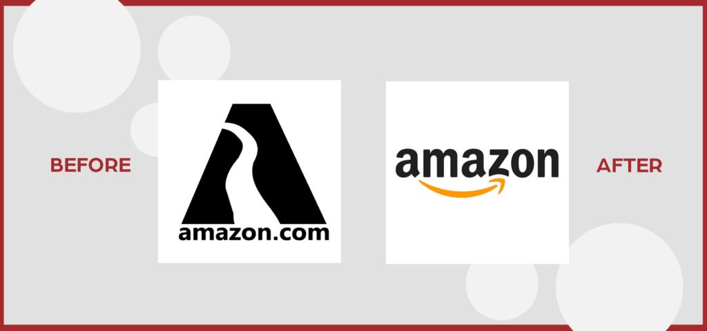
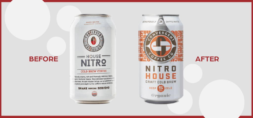
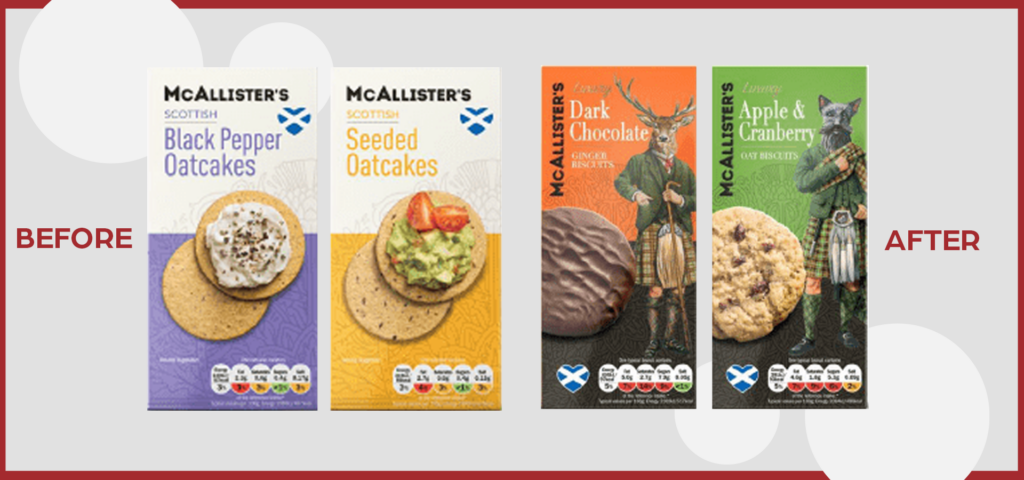
The best designs come from the balance between aesthetics and function.
This balance creates a sense of purpose for those individuals who look at functionality first and that aura of beauty that others crave.
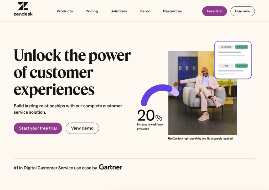
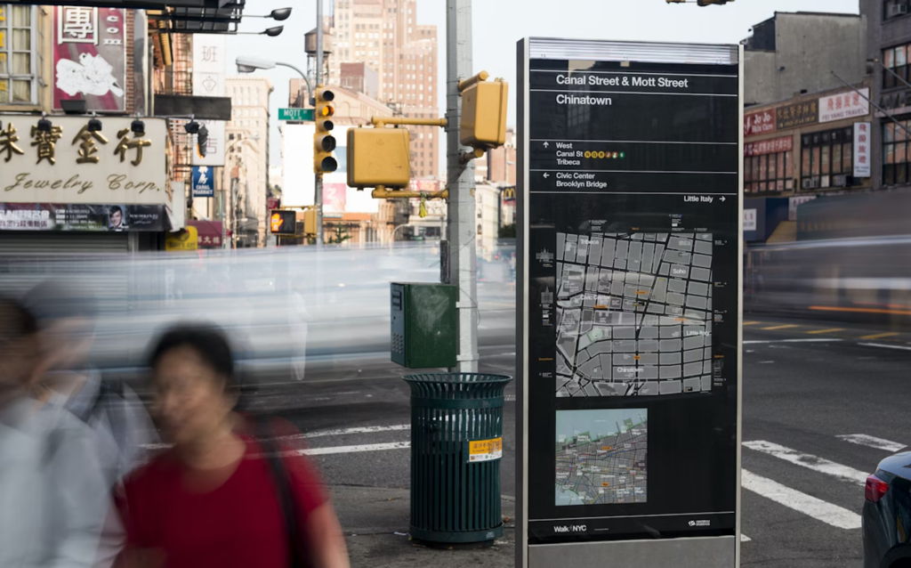
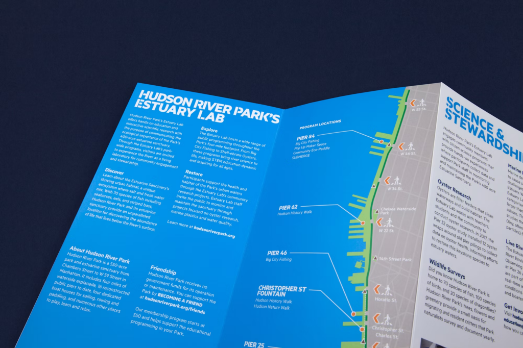
Here are some examples of harmonious designs that check off the boxes for both aesthetics and functionality:
What are some examples of favorite designs you’ve seen? Any particularly perfect combinations of form and function that stuck with you?
Reach out to us on social media and let us know!
Slice is also very happy to help you with your design needs. From simple projects to full rebrands and logo design, we have a wide range of experience and would love to work with you to create something that makes you proud and is truly attention-getting from the right audience.